Rilco Safety Supply | Brand Extension & Sub-Brand Development
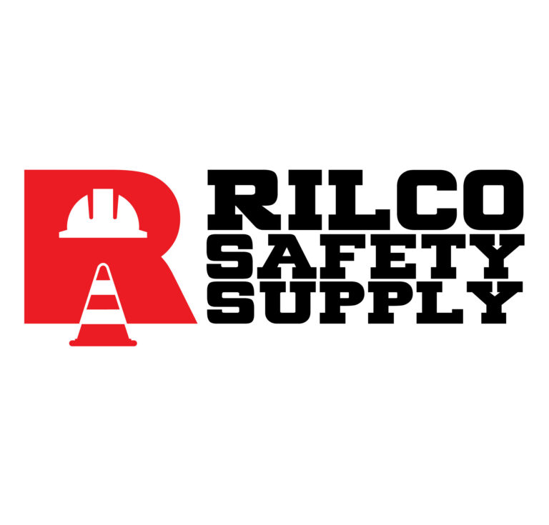
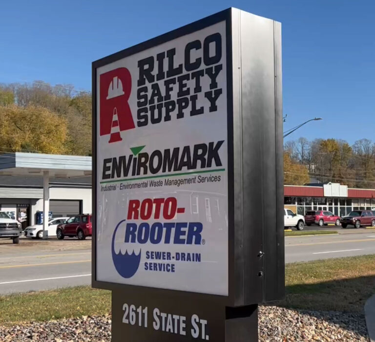
Following the diversification of RILCO, Inc. into the industrial safety sector, I was tasked with developing a specialized brand identity for Rilco Safety Supply. The primary challenge was to engineer a visual mark that maintained clear brand equity within the RILCO family of companies while establishing a distinct and authoritative presence in the safety equipment market.
Strategic Design & Visual Execution:
Brand Lineage & Cohesion: Utilized a bold, block-style typographic system to ensure immediate recognition and alignment with the parent company’s established professional reputation.
Targeted Iconography: As illustrated in the design, the logo integrates high-contrast safety symbols—including a hard hat and a safety cone—directly into the negative space of the primary brand mark to communicate industry specialization at a glance.
Color Psychology & Impact: Employed a high-visibility red-and-black palette to evoke a sense of urgency, protection, and professionalism, adhering to standard industrial safety conventions.
Scalable Graphic Architecture: Engineered the logo for maximum legibility across diverse industrial applications, including:
Large-scale storefront and warehouse signage.
Apparel and work uniform applications, including high-visibility vests and embroidery.
Digital platforms and industrial equipment catalogs.
- Delivery Vehicles